Intro
The below projects come from my time working in The Public House - an independent Ad Agency in Dublin. I was a Junior Art Director and learned a lot of my creative trade there, before moving on to develop my graphic and motion design skills. Particularly, I learned the importance of the underlying idea - and how design is only there to help communicate this idea. Without a strong starting concept, design is superficial.
Cadbury - St. Patrick’s Day Campaign
Social Media | Digital | Packaging
Brief: Remind people - in an authentically Irish way - of the age old link between Ireland and the Cadbury Dairy Milk bar for St. Patrick’s Day.
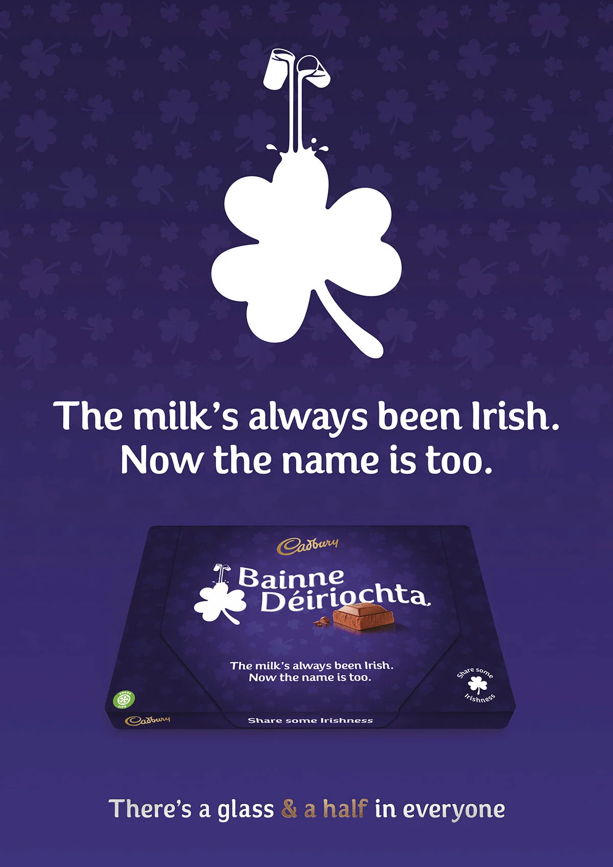
Idea: Translate the name of the bar into Irish/Gaeilge for special edition packaging to show that Cadbury don’t just paint things green.
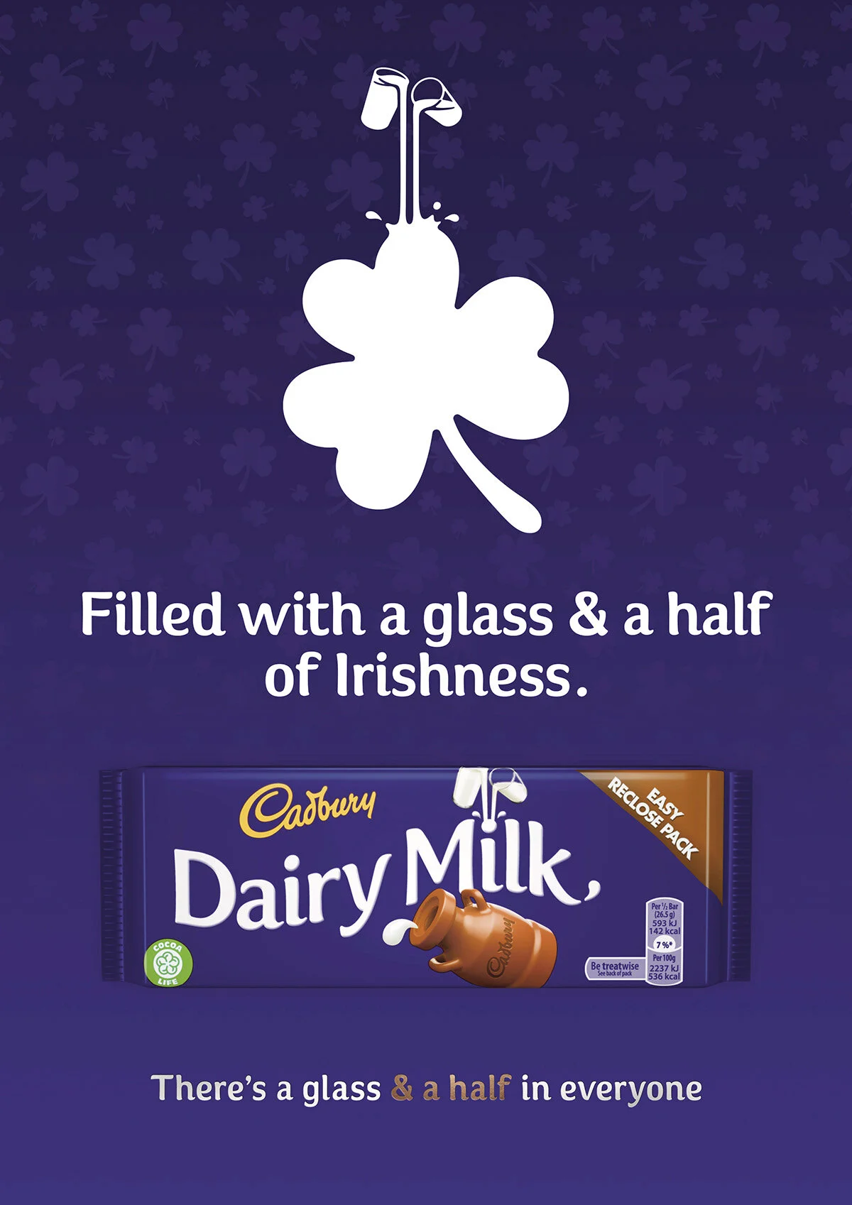
Normal packaging design in 2020.
We had to keep the style and typeface while also fitting the entire translation onto the bar for the special edition packaging.
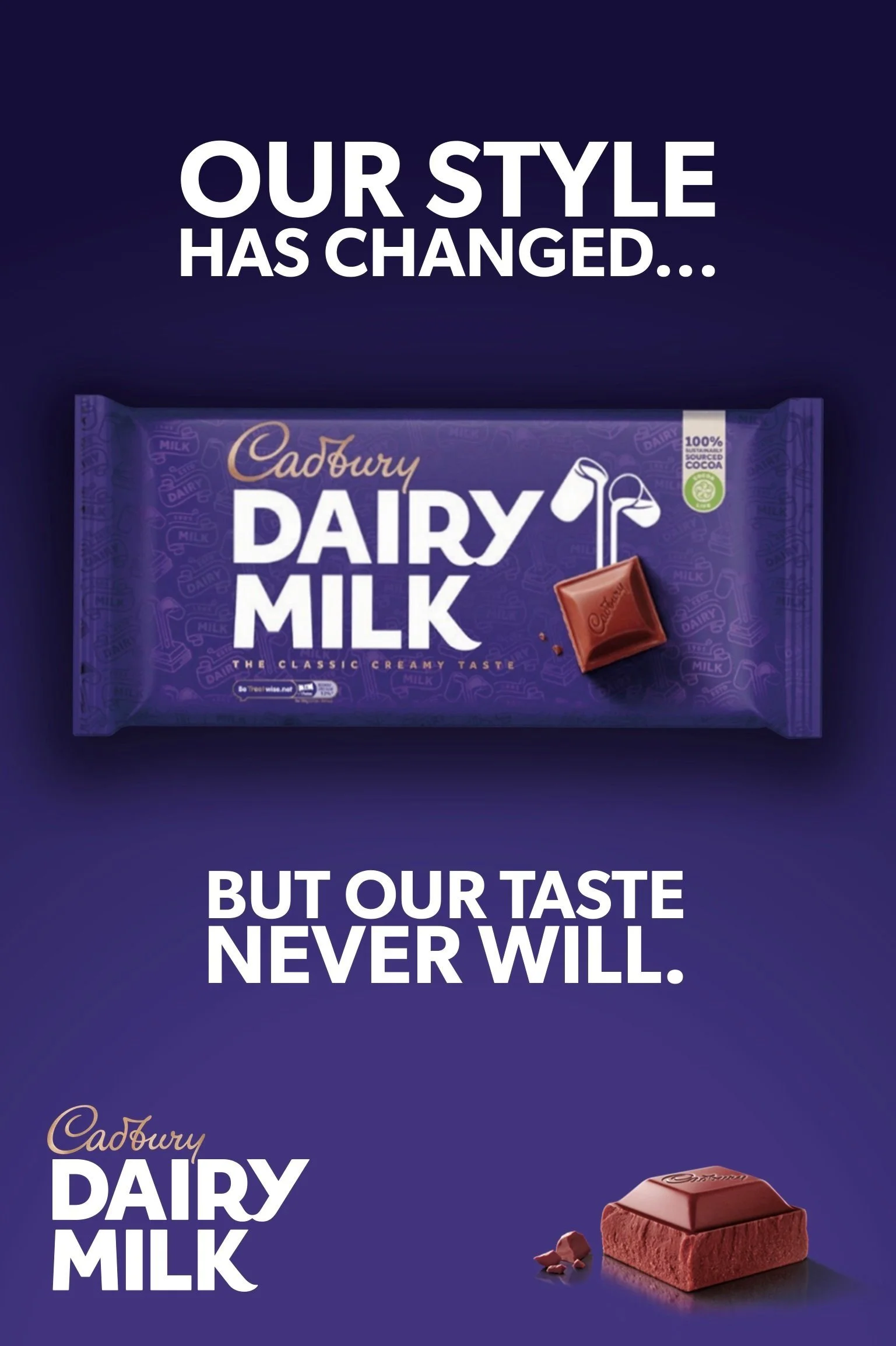
The normal packaging changed in 2021.
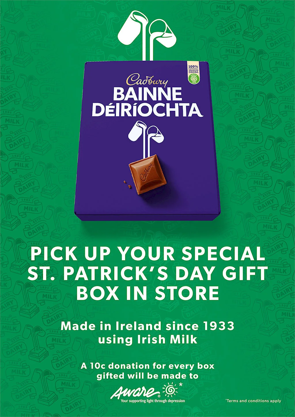
When the campaign launched again in 2021, the branding had changed, so the special edition packaging also had to change.
EPIC Museum - Herstory Campaign
Activation | Print
Brief: History has largely been written by men. How can we commemorate the Irish women who have played major roles in our history but have not been recognised in the literature.
Idea: Statues are society’s way of recognising a person’s achievements, but Ireland has very few statues of women. We highlighted this by constructing a plinth with an inscription dedicated to influential women who should be standing on it.
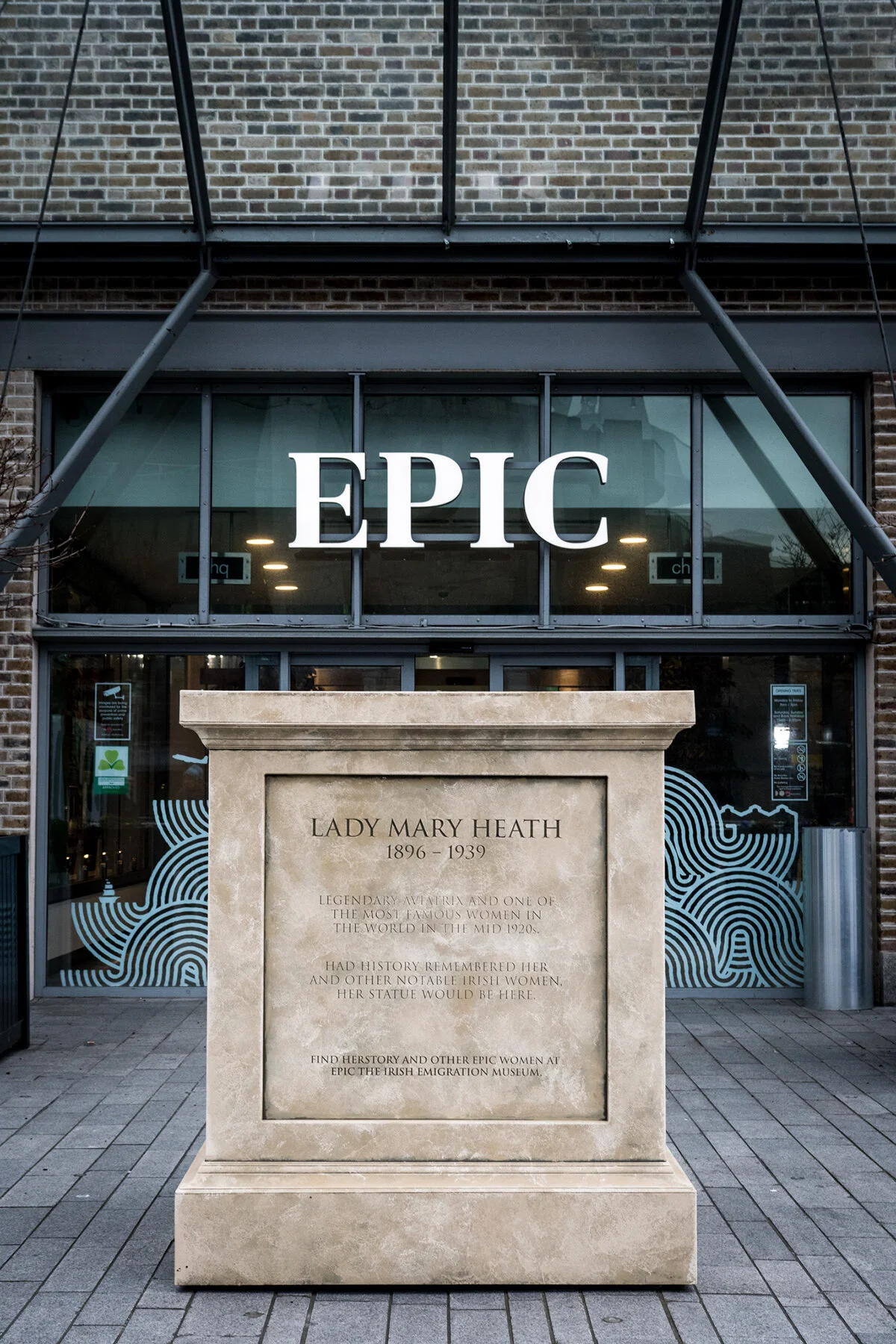
Once EPIC bought the idea, we had the plinth built and sent to the city centre.
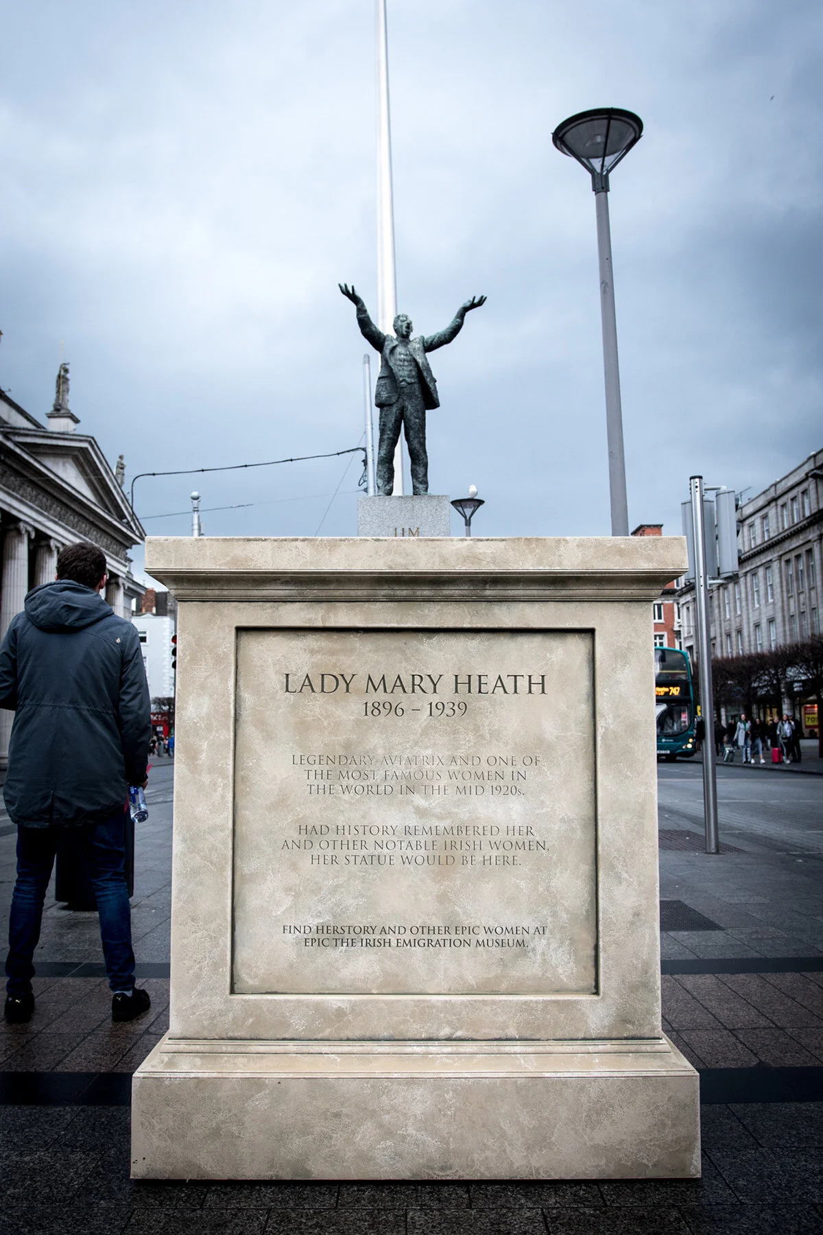
We positioned it alongside famous statues of men to gather attention and for photo opportunities.

The campaign that ran alongside it used typography and a simple colour pallet.
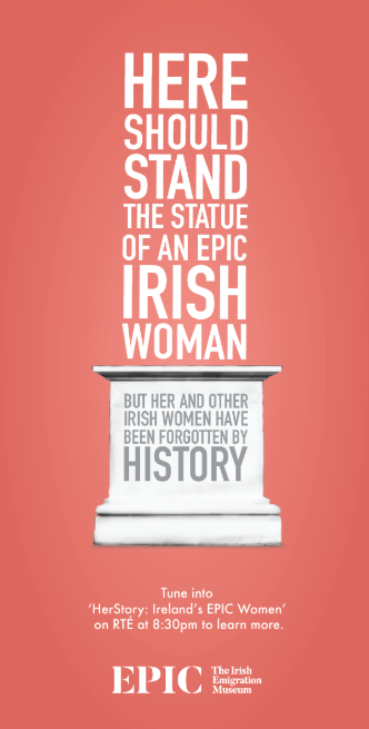
I designed brochures that were then printed out and given to members of the public...
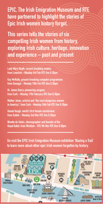
with information on the campaign, where the plinth will go next and a map to the museum.
Toblerone - Father’s Day Campaign
Social Media, Digital, Print & OOH
Brief: Create a link between Father’s Day and the Toblerone chocolate bar.
Idea: Use a classic Irish colloquialism - spending time on your (Tobler)own - to encourage people to spend some time alone with the old man on Father’s Day.
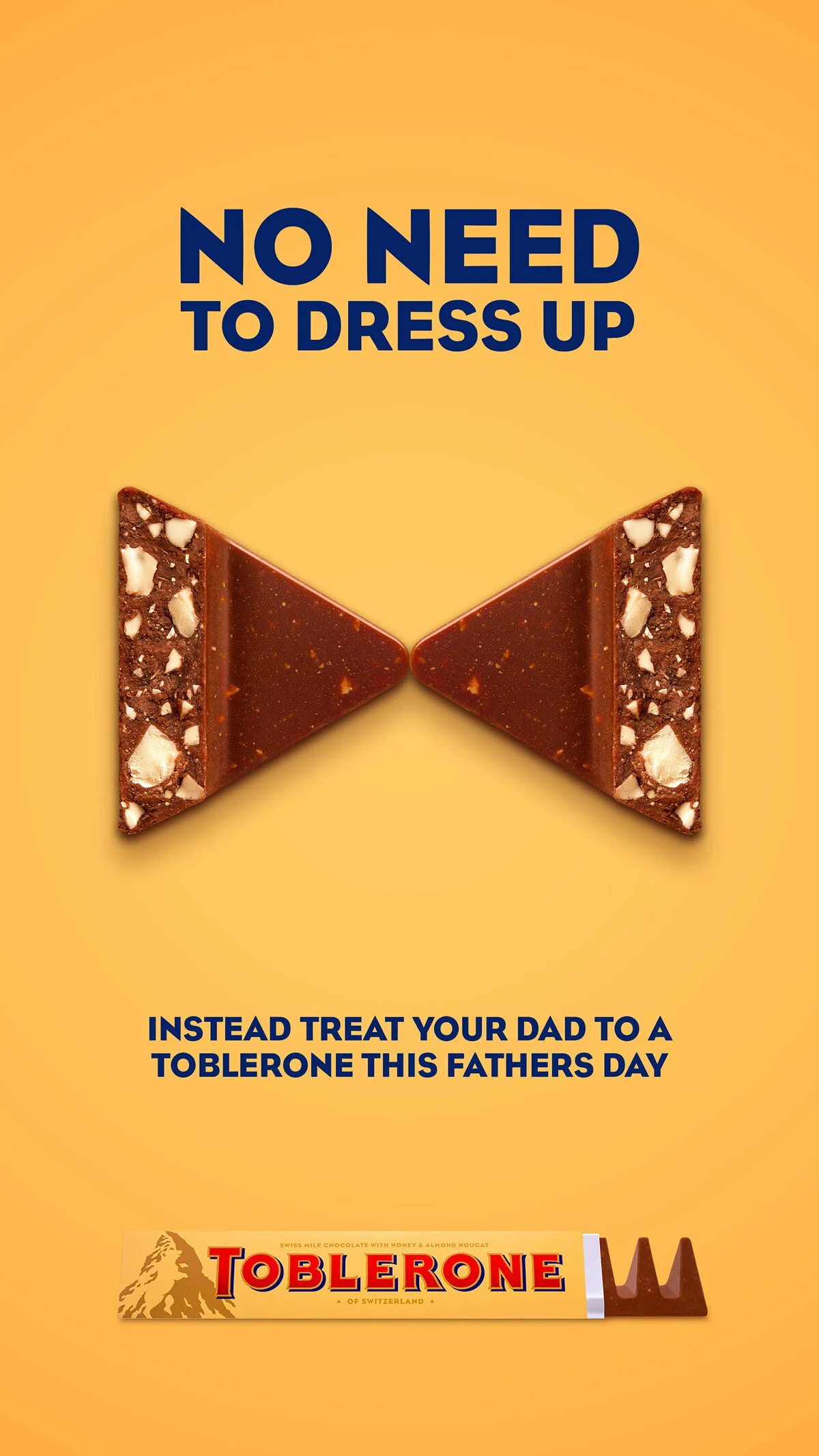
We used the chocolate triangle itself to represent activities you should skip in favour of spending some quality time with your dad.
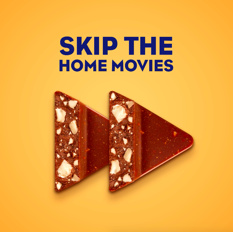
We opted for recognisable symbols and common activities, such as Netflix...
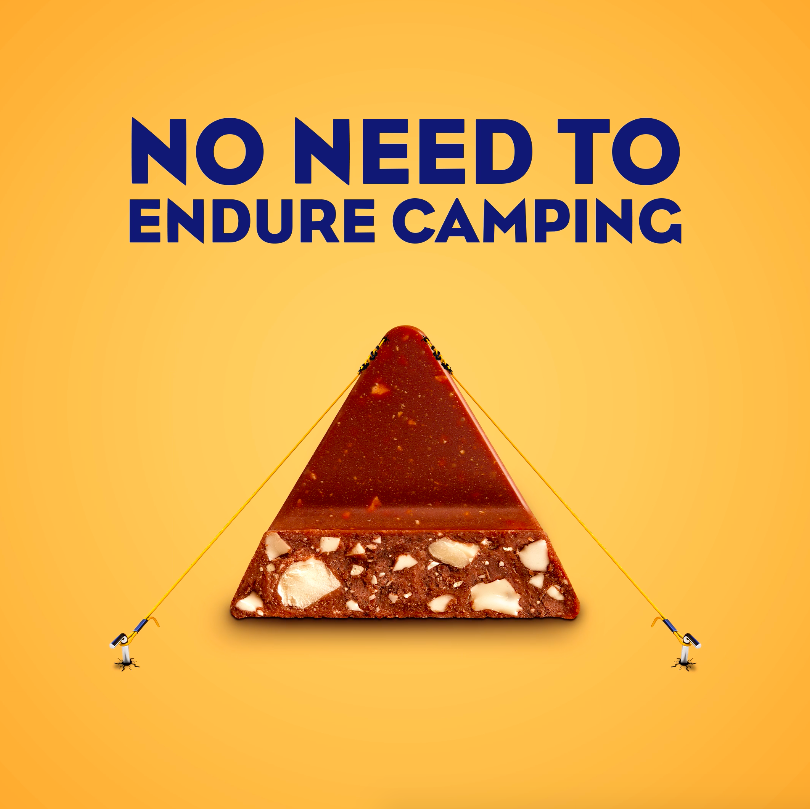
Or the classic camping...
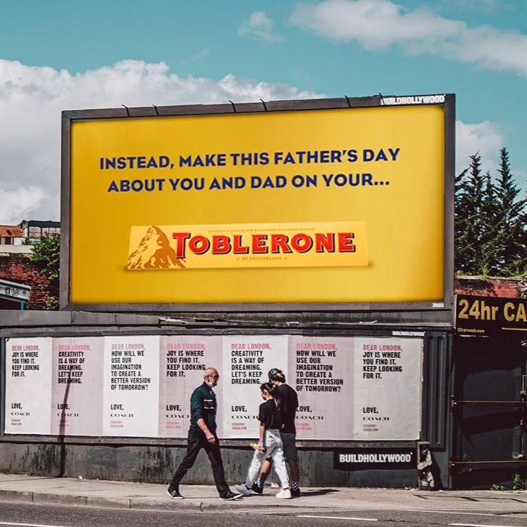
The final line tied the campaign up in a uniquely Irish way.
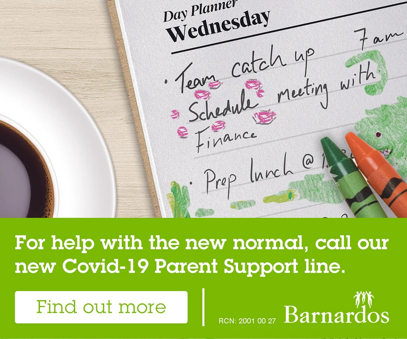
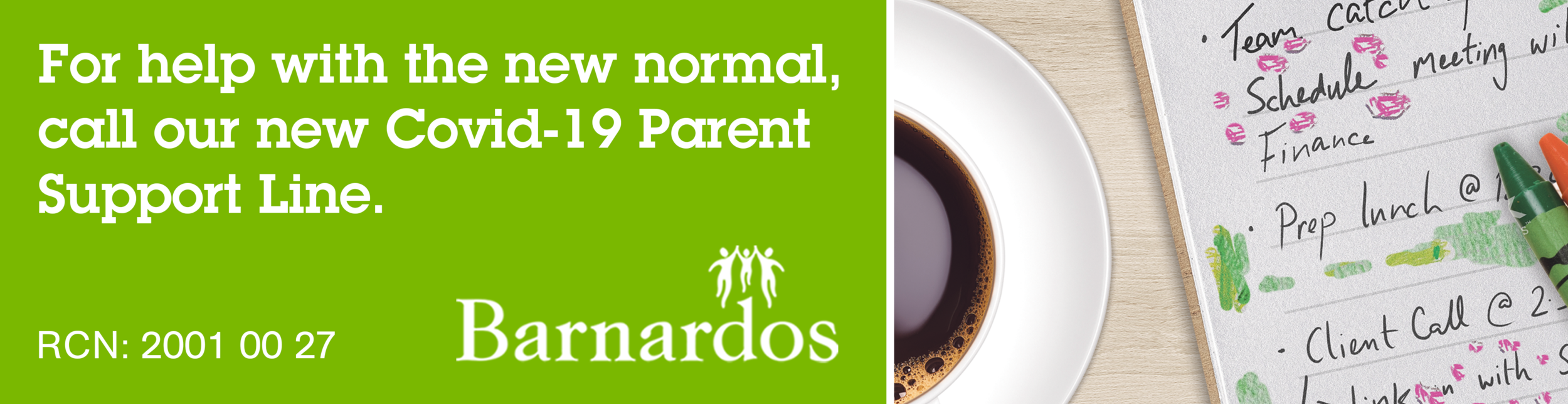
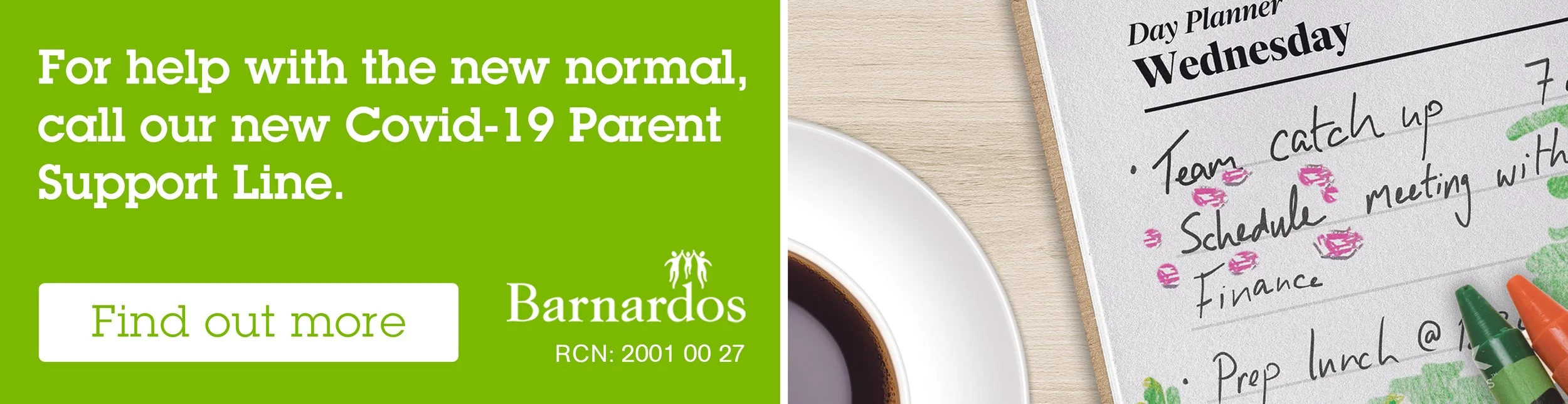
Barnardos - New Normal Campaign
Digital
Brief: A digital campaign to raise awareness about Barnardos new service for parents who are struggling with 24/7 indoor life with their children during the pandemic.
Idea: An image that perfectly demonstrates the collision between work stress and parenting stress.

I found a base visual on which the campaign could be built.

Then began to add elements associated with children and messiness/playfulness.
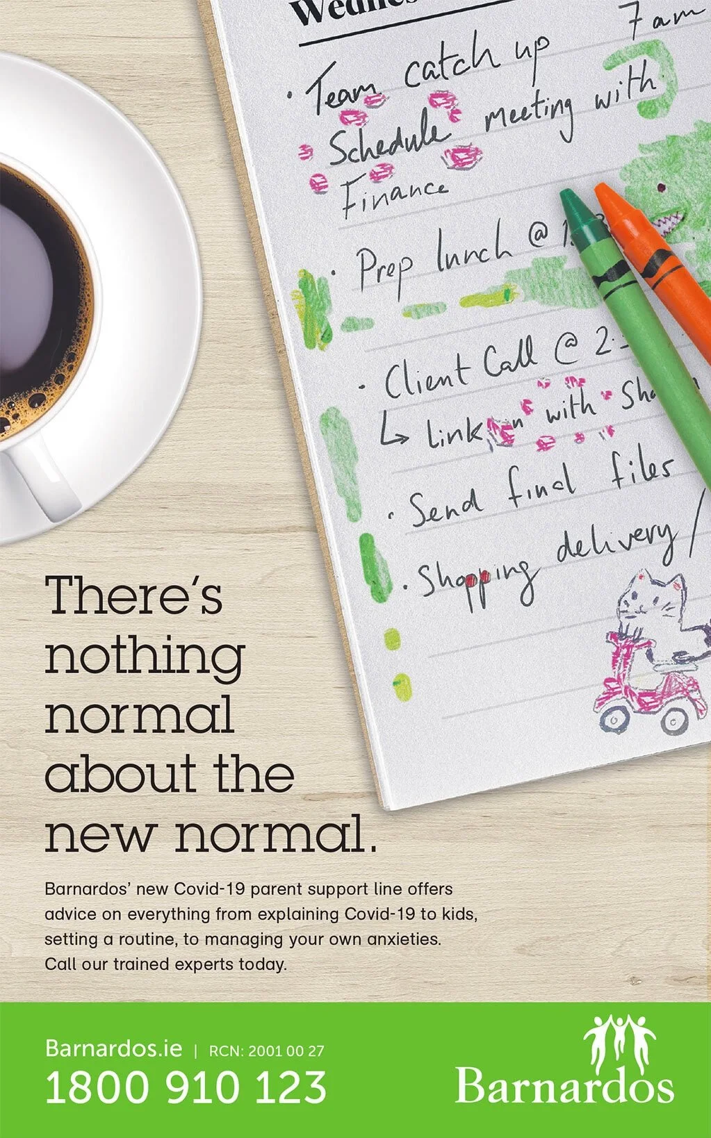
The final campaign ran across all digital formats, containing the copy and contact information.
A day planner with handwritten notes for Wednesday, including tasks like team catch-up and finance, with pink and green markers nearby. Part of a cup of coffee and a green promotional banner at the bottom encouraging parents to call a COVID-19 support line, with a 'Find out more' button.
A green banner with white text encouraging parents to call a Covid-19 support line, featuring a glass of coffee, a notepad with handwritten notes and pink ink markings, and a green marker on a light wooden surface.
Green advertisement for Covid-19 parent support line on the left, with white text and a white call-to-action button reading 'Find out more.' On the right, a wooden day planner page for Wednesday with handwritten notes on meetings and schedules, partially overlapped by a cup of coffee and some colored pens.
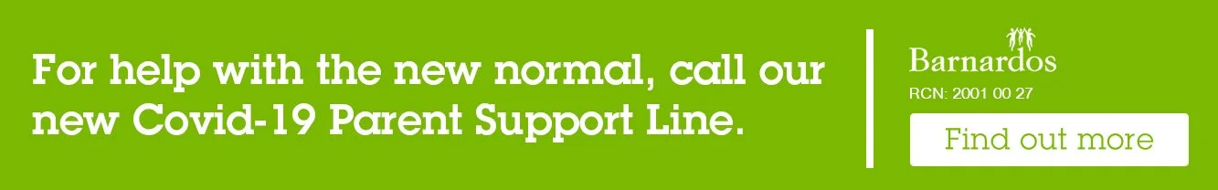
Green banner with white text promoting the new COVID-19 Parent Support Line by Barnardos, and a 'Find out more' button.
Saint Charles Biarritz
Clothing | Fashion
Brief: Create a minimalist design for a range of t-shirts inspired by the quiet Saint Charles neighbourhood of Biarritz, France.
Idea: Give the text a slightly lighter, faded tone than the t-shirt’s colour, reflecting the subtlety of the central ‘quartier’. I applied this to six different colours.
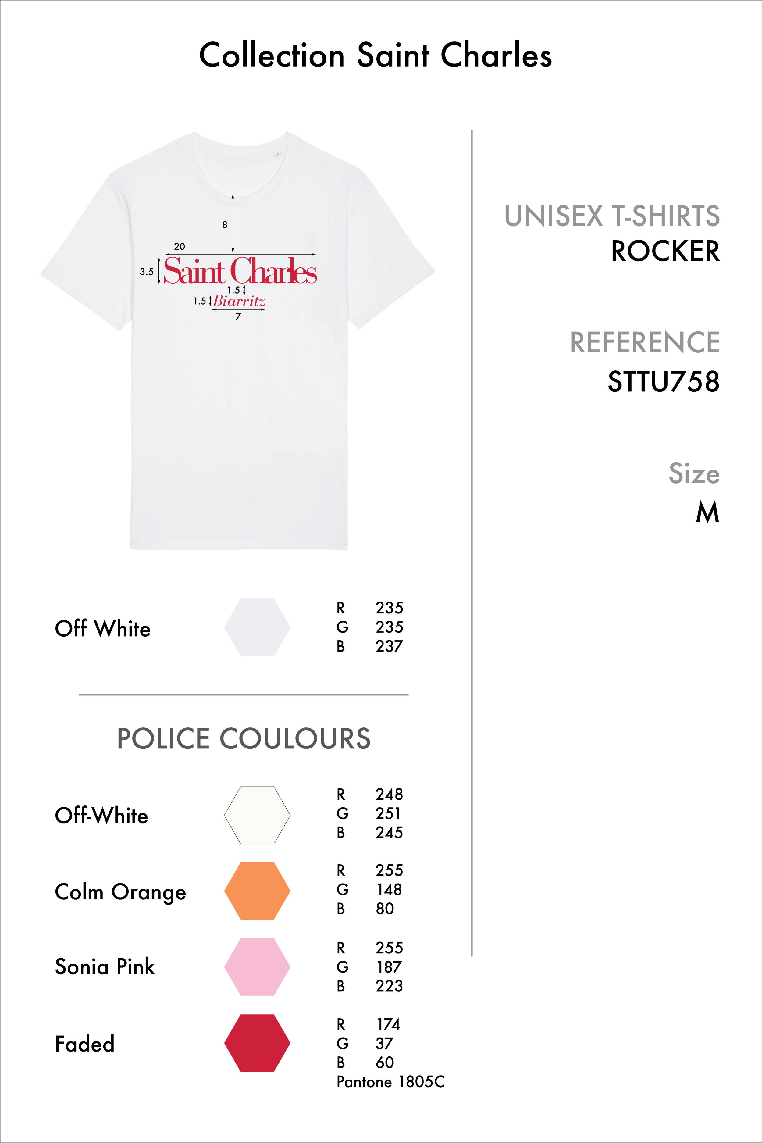
First, I had to design the technical file for each colour t-shirt, with measurements, typeface, RGB values, reference (for furnisher) and size.

After ordering 120 t-shirts (20 x 6 colours), we then began the process of marketing them. I did this through Instagram...
selling 12 t-shirts - €30 each - on my first day to people back in Ireland, posting them with a courier.
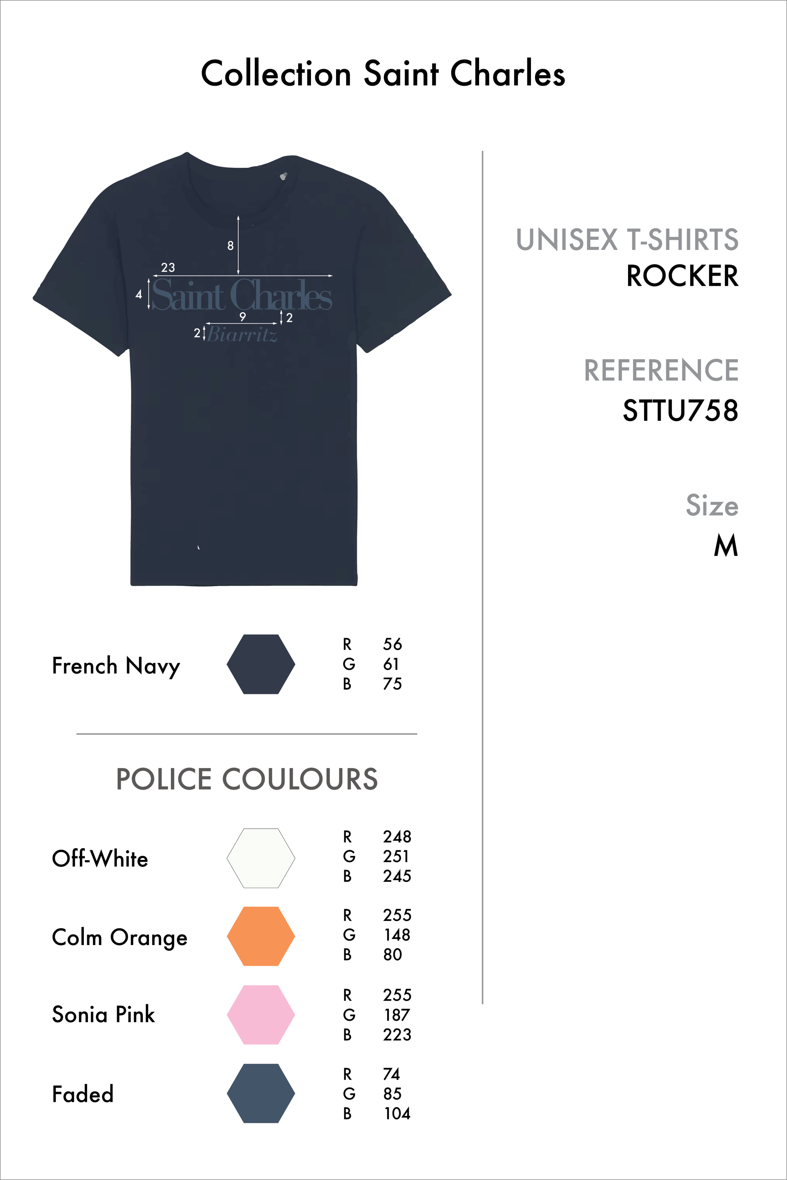
Design for a navy unisex T-shirt from the Collection Saint Charles, size medium, called ROCKER, with reference STTU758. The shirt's color is French Navy, with RGB values R 56, G 61, B 75. The image includes swatches of other police colors: Off-White, Colm Orange, Sonia Pink, and Faded, with their RGB values.
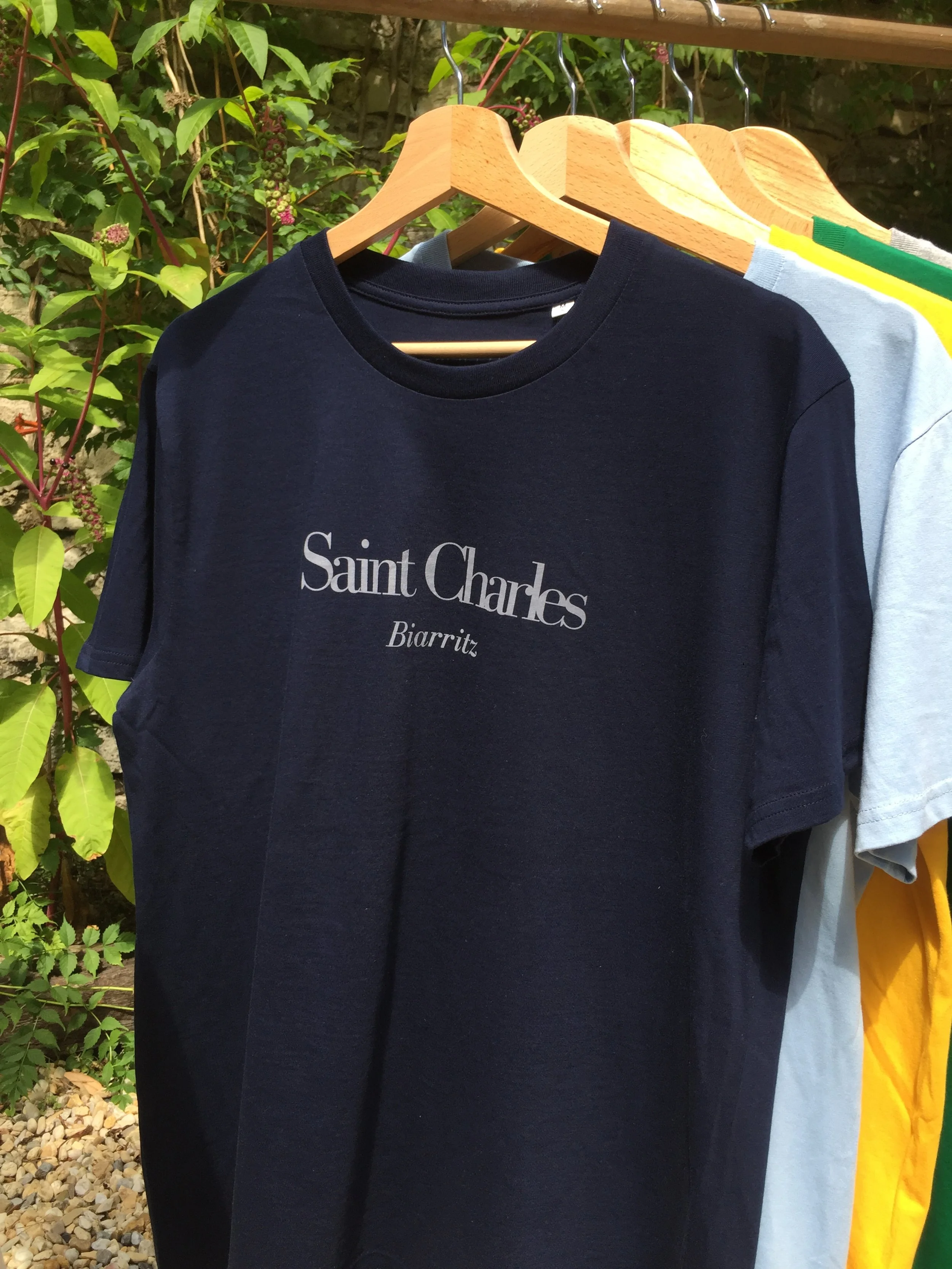
Black T-shirt with white text reading 'Saint Charles Biarritz' hanging on a wooden hanger outdoors among other colorful T-shirts.
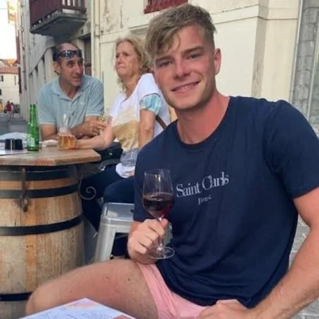
A young man sitting outdoors at a table with three older adults, holding a glass of red wine, smiling at the camera.
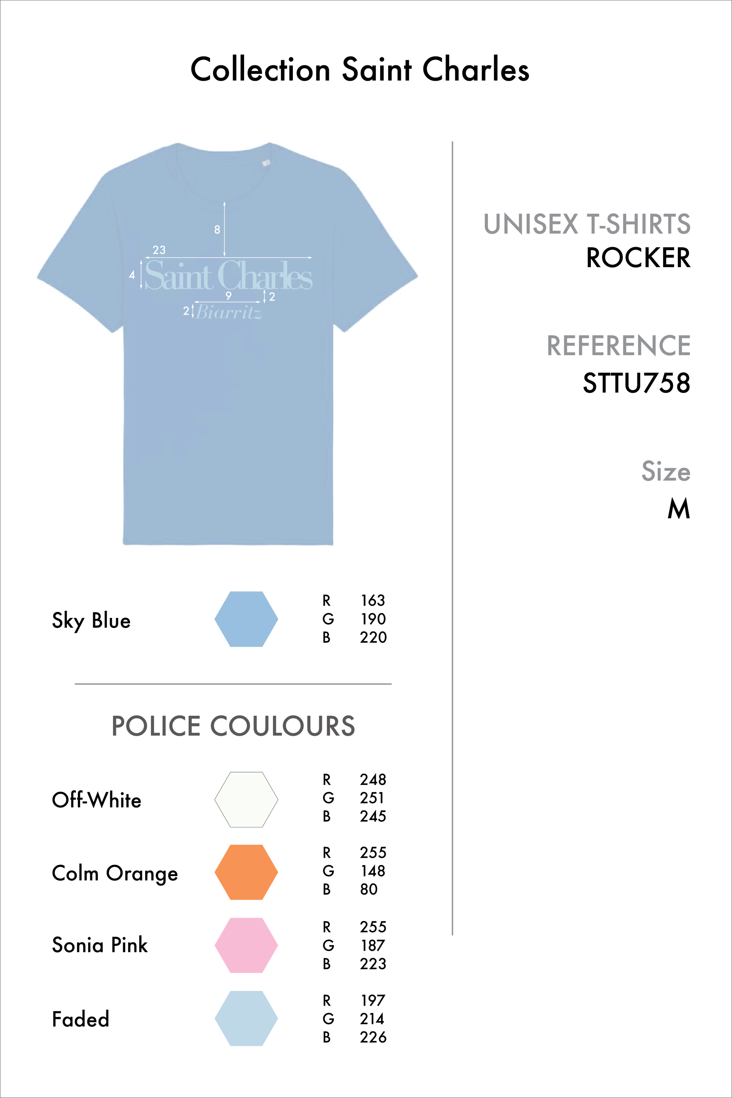
A design specification sheet for a unisex T-shirt from Collection Saint Charles, featuring a Sky Blue color with its RGB values. The sheet also lists police colors with their RGB values: Off-White, Colm Orange, Sonia Pink, and Faded, along with a hexagon shape of each color.

Light blue T-shirt hanging on a wooden hanger with white text that reads 'Saint Charles Biarritz'. Behind it are yellow, green, and gray garments hanging on a rack.
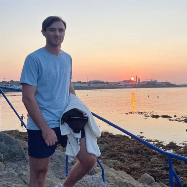
Young man standing on rocks by the water at sunset, holding a jacket, with city skyline in the background.

Green T-shirt with the text "Saint Charles Biarritz" printed on it, hanging on a hanger outdoors, next to a gray shirt.

Gray t-shirt hanging on a wooden hanger outdoors with green plants and flowers in the background.

Yellow T-shirt hanging on a wooden hanger with the text "Saint Charles Biarritz" printed on it.